Making a shopping hub for pros and retail alike
Sally's websites cater to both professional and retail customers, my job was to design an account section that worked for everyone.
My Role: UX Lead, UI Lead


Background
Sally's Account screens had been relatively neglected. Whilst standard account functionality was present for users, there were a few major issues:
Users could not update some basic details without contacting customer services
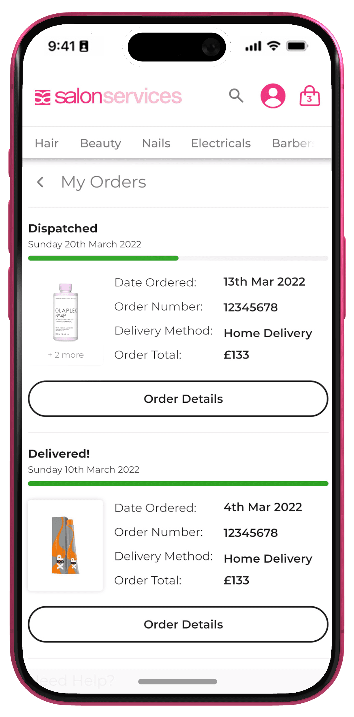
Order tracking contained no visuals of products or option to revisit PDP/re-order items
Wishlist did not contain add to cart functionality and naming of the feature across the site was inconsistent
Besides icons, the interface was incredibly bare bones and had unecessary repeating elements such as the menu items displaying twice
In addition to this, there was an appetite within the company, to not just fix and optimise the account screens, but make 'My Account' a shopping hub of sorts for customers. The CX team were not given direction on this requirement, so a lot of thinking went in to what we could do to add new features in order to bring this section to life.
Insight and Planning

Building new features for a guided experience
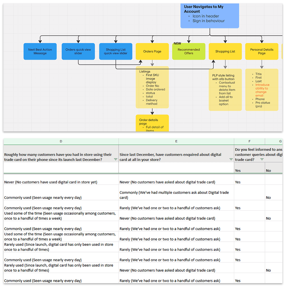
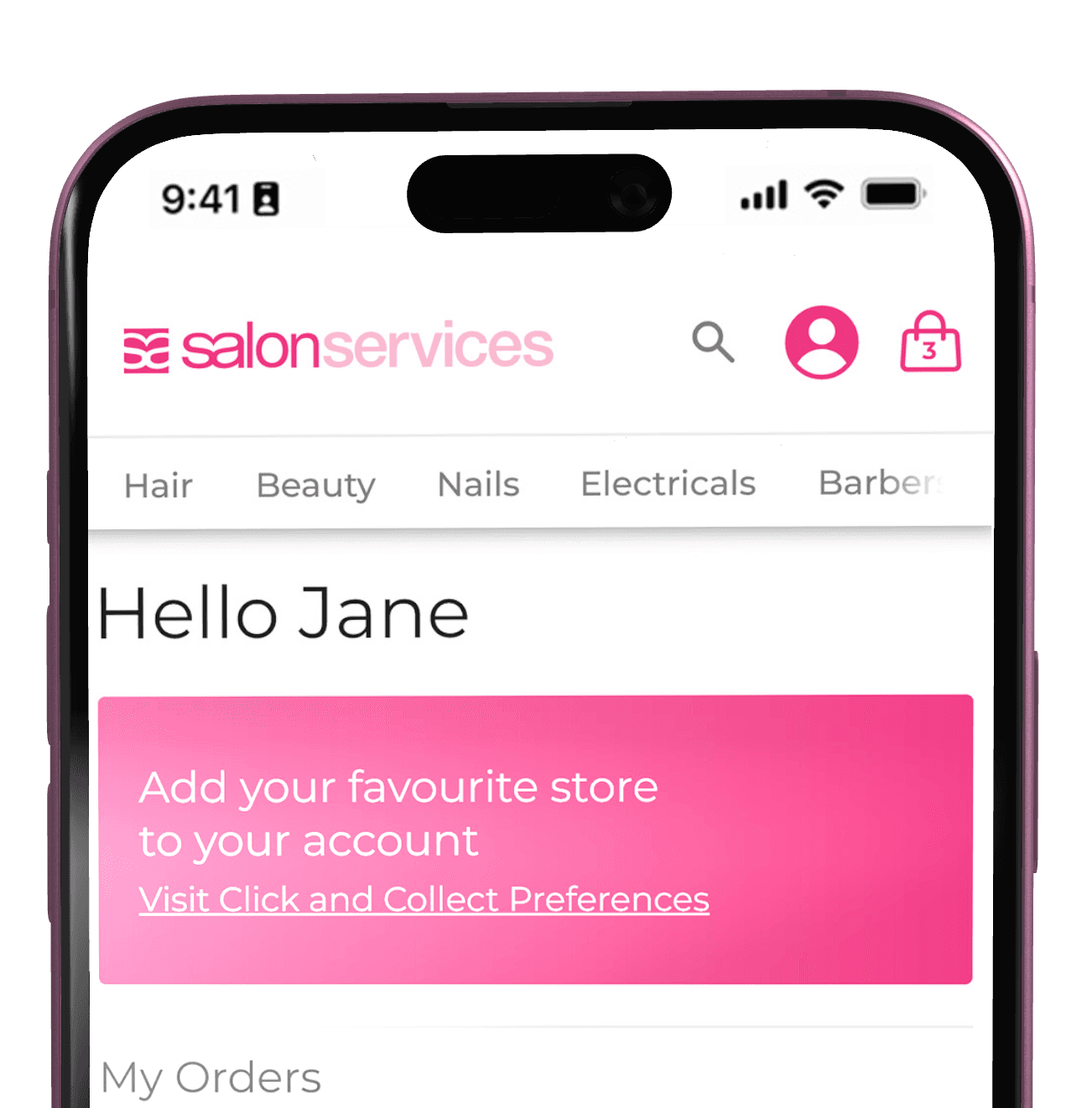
The research conducted showed that there were quite a few features that users weren't engaging with. Seeing that the My Account screen was only behind Search, PDP and Basket in terms of views presented an opportunity to design the account space to highlight core "next best action" messaging to ensure the user was getting the most out of their account. I designed a set of configurable messages to show on visit to My Account if the user account met a certain criteria.
These messages were both functional and promotional in scope. For example, the main user goal of visiting My Account was to check order status, so this message would show that pertinent information if a user had an order that had recently shipped. Messages were also added to nudge the user to adopt the digital trade card for shopping, or add a local store for accurate click and collect messaging.
On top of this I added a more visual way to engage with recent orders and shopping list items by adding sliders above the main My Account menu, allowing quick access to the most widely used features of the section. These were also made more visual, using lead product thumbnails for more immediate recognition.
Highlighting features
In our research we saw that despite being named inconsistently throughout the site and actually being quite buried in our My Account section, users were engaging with our shopping list feature. We wanted to both bring this to the fore, notifying users when items they had added to the list were on sale, but also saw this as an opportunity to further personalise the user's shopping journey, with a dedicated notification system.
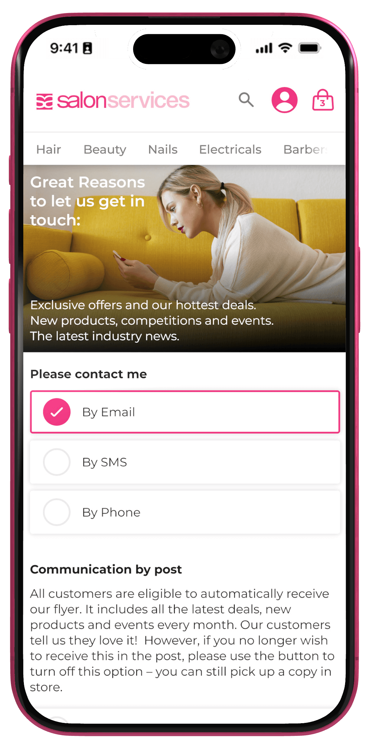
Under the new design, users would be notified for both order updates and when shopping list items were on sale. The solution here was to use an unobtrusive notification on the user's account icon to nudge them to the area of the site. Once there users could see in the menu any relevant updates of interest to them. All of this is also configurable from the user's end.

Integrating first-party data to highlight offers to users
Highlighting order status changes or that shopping list items were on sale was easy enough from a design and implementation perspective, but we wanted to go a step further in giving customers a more personalised experience and make the My Account screen more of a shopping home for our customers.
There are lots of deals on Sally's websites that cater to many different customer groups, and we had feedback that these can be overwhelming. My idea was to properly integrate our first party data into customer groups to then better target users with offers that they resonated with.
I designed various customer grouping logic with the data we had at hand such as; users who had added [BRAND] to their shopping list in the last [X] days or; Users who had purchased [X] amount of [Category] in the last [X] Days. These were passed to dev to implement into our CRM. Whilst we couldn't achieve everything to design, we ended up with some great grouping tools that our merchandisers could use to target offers to customers.
The front-end interaction for this needed to be simple and unobtrusive. Using the same notification system mentioned above we were able to notify users to navigate to the new section of the site when an offer was triggered for them. From there implemented a simple swipe to dismiss card system to enable users to swipe through offers quickly and easily tapping into any that they were interested in.
Offering an omnichannel shopping experience
One of the most important aspects of this project was to bring the customer's trade card (a requirement for shopping for trade prices in-store) onto our digital platform.
The business wanted to move away from printing physical cards for new customers, but our digital trade card didn't have a home. With the new account system, we automatically added an accessible bar code on the site for the customer to reference and use in store, we also added accessible options to save the code offline in relevant wallet apps for the user. A "next best action" message was designed to nudge the user to add their card to their mobile wallet if they had not yet done so.