Setting the stage for Better UX
Sally needed a clear, comprehensive and coherent component library and design system.
Role: UX Lead, UI Lead


Background
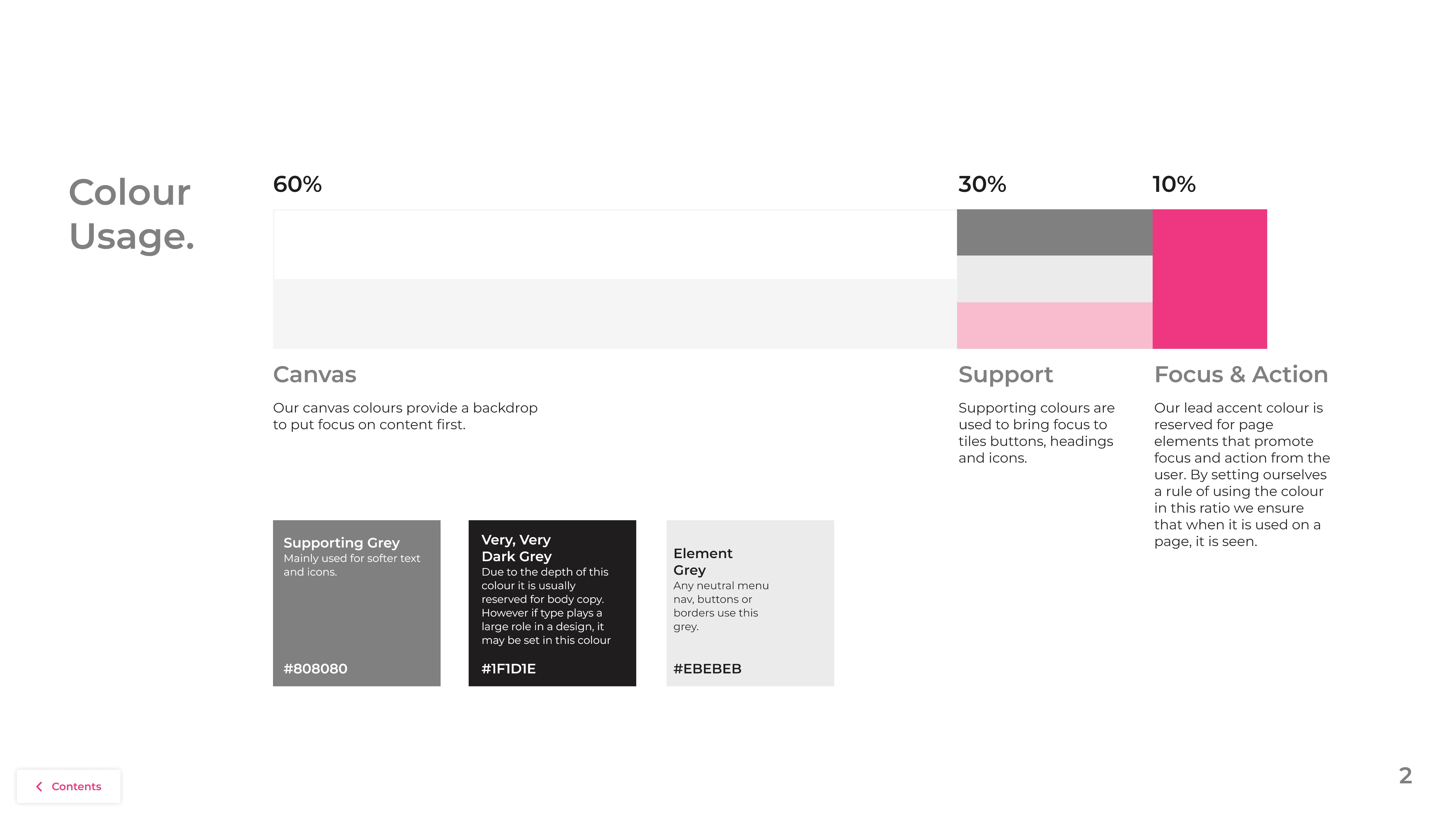
When I joined the Ecommerce team at Sally, the site was full of a mixture of component styles all performing the same function, CTAs were styled differently to one another and many assets were not fit for purpose, with text styles breaking the assets that they were in. There was also no clear colour or text style hierarchy, with font use being sporadic and inconsistent. It was clear that fixing the main component issues with the site would not only result in a cleaner looking UI and a better UX, but would also have a positive impact on site speed by cleaning up all the copies and variants of components that were floating around.


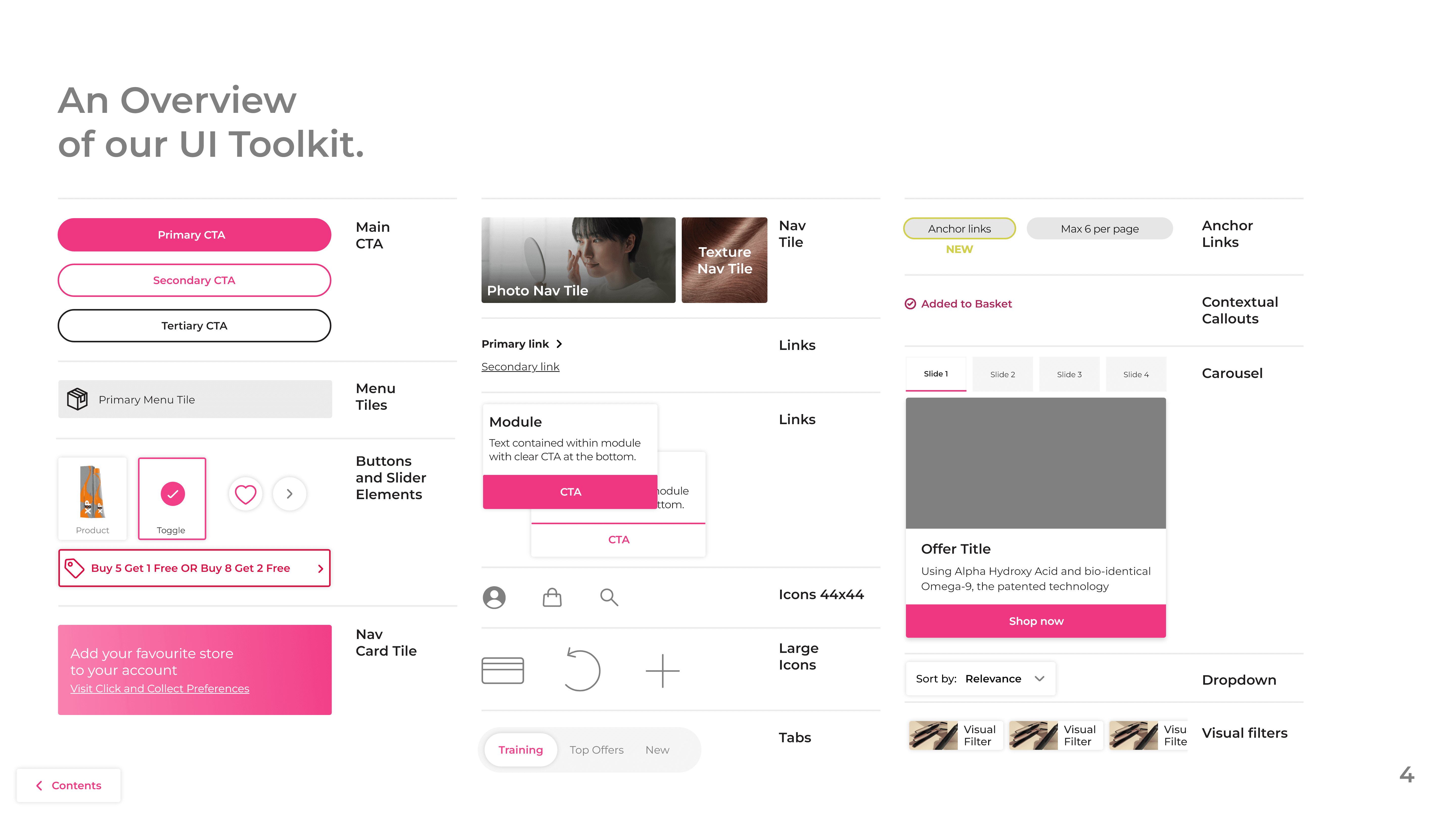
Creating a component library for use across the business
As well as an online guidance document available to everyone, I also created a Figma component library to be used across projects. This took into account any requirements from the design and usage guidelines where possible, so things like max and min widths were automatically taken into account. I also set up the library to work with modes for the different brands across the company's 10 websites, so palettes and styling could be changed at the flick of a switch.
This centralised approach meant that when we had a change to a component, we could do so across our designs, saving our small team valuable time. Having all assets centralised like this also made working with developers to sync things up easier too, updates pushed to the design system components were also marked up for devs, so we could make sure what was in our designs and what was on site lined up.
Validating changes to move forward with what works
Besides some core elements that were tied to the company's various brand identities, the scope of changes to be made in this design system were fairly all encompassing and vast. I wanted to make sure that each change we made, from text styles to wholesale component changes could be validated and that we could be confident in our decisions. As such, many changes were A/B tested against our current design and if applicable, against other potential variants.
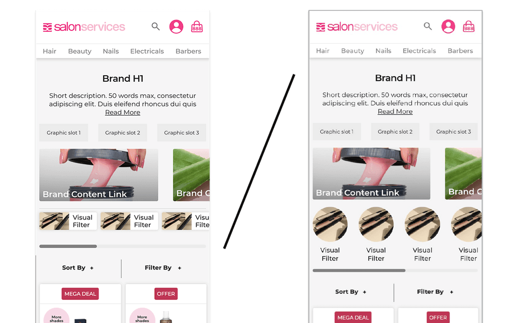
In the pictured example, The site had roundels accompanied by text as jump links between sub-categories. These took up a lot of vertical space and on some pages there were over 12 links per PLP. We also had issues of spacing on the label text, where labels would run into one another. For the design system I presented 2 possibilities; one closer to the roundel design with an attempt to mitigate text issues, and another that re-imagined jump links as tiles similar to other buttons we were introducing in the new system.
We saw a 3.2% lift in add to cart events as well as a 1.8% lift in average page views with the brand new design, as well as a 3.6% rise in overall conversion. This led us to confidently choose to push forward with the newer, slim-line design.