Sally's brands have a complex offering to customers over Europe, this project was about giving customers the right tools at the right time to explore Sally's offerings.
Role: UX Lead, UI Lead


Background
In 2021 joining Sally's Ecommerce team as its first dedicated UX designer, some parts of the site grabbed my immediate attention in terms of what needed improvement. Perhaps most obvious was the very weighty and busy site header which gave user's a very muddy first impression of the site.
The overall footprint of the header was large, taking up up to a third of the viewport on mobile displays
The header was incredibly busy, packed with messaging and inconsistently sized icons
Search was exposed on mobile, despite the header already being large
Navigation had 4 levels and over 15 top level categories
The user had no indicator of whether they were signed in or not
"Trade only" messaging on trade sites was persistent and intrusive
We needed to put a focus on usability and clarity of messaging within our nav, with a focus on strong brand elevation.


Understanding the issues
Lots of the research on this project relied on competitor research in order to locate pain points and solutions to the issues we faced. There was also the matter of different levels of the business had vested interest in the priority of elements. We took a granular look at each element and got data where we could on each. Using this data we were able to prioritise the importance of each item in the nav and the emphasis it needed.
We had to make pragmatic decisions to improve the navigation UX and started by creating a set of user stories in which to benchmark designs against.
Ideating variants
Off the back of our research and fact finding, I got to creating multiple variants of header design. At this point no idea was off the table. Here I experimented with sliding top level nav on mobile, different Icon and search placements, as well as looking at how to present deeper levels of the nav to the user. This ranged from traditional page by page/split designs, to a more experimental personalised highlight approach.
These ideas were presented to stakeholders and key features were discussed. An agreement was made to focus the user's journey on shopping online, so store search would move to the footer of the site.
The other key changes were A/B tested:
We tested an exposed search against an icon on mobile in a split test. With no significance granted to either variant on search usage, we moved forward with an icon for search on mobile viewports.
We tested the more experimental sliding navigation against the traditional hamburger menu treatment. Visitors who saw the sliding nav spent longer on site and visits to our top categories rose by 20% compared to a hamburger menu. There was however, a starker fall off on lower down main category visits. The decision was made to continue with the sliding nav, this was mainly down to the business prioritising categories such as hair and beauty far more than items lower down the list. It also seemingly helped with brand awareness to new visitors.
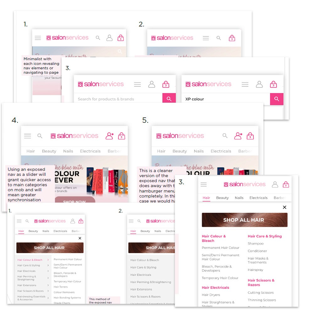
Presenting a simpler navigation to the user
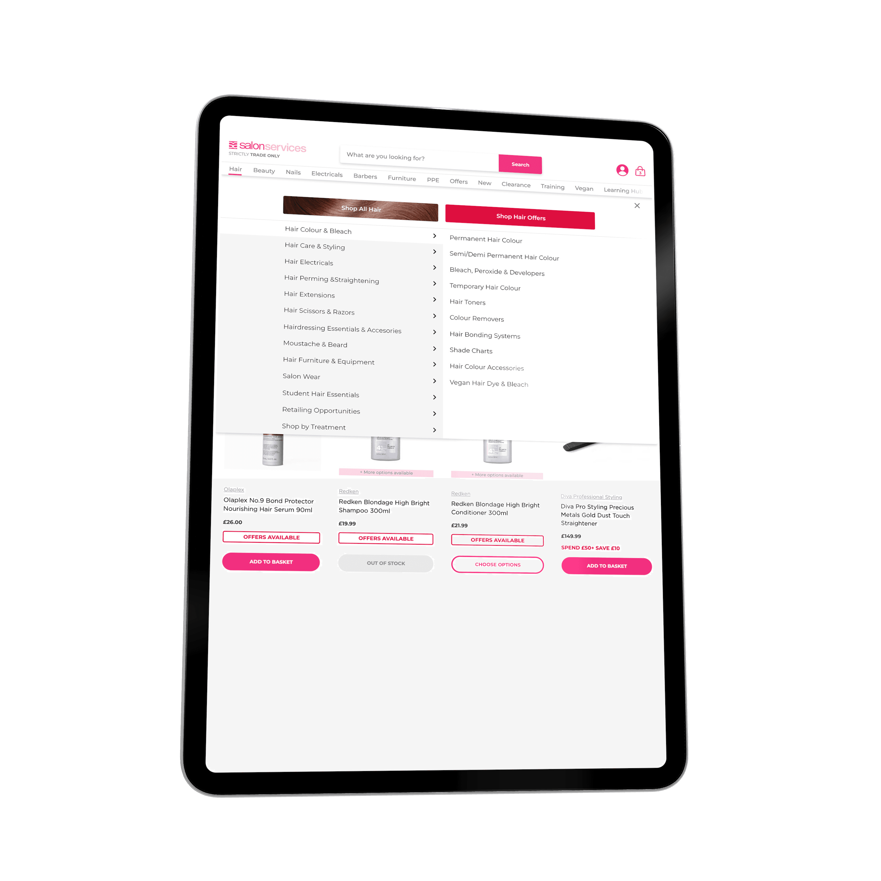
With core decisions made, I set to prototyping the new smaller footprint header and nav. A small win with category management meant that we could now do away with the much too granular fourth level of nav, but despite that, the navigation structure I had to design to was still very dense.
To alleviate this, the design included visual tiles to jump to category/listing pages, we found that the sooner we got people to a listing off nav, the more converted customers we got, so this was a priority in the design.
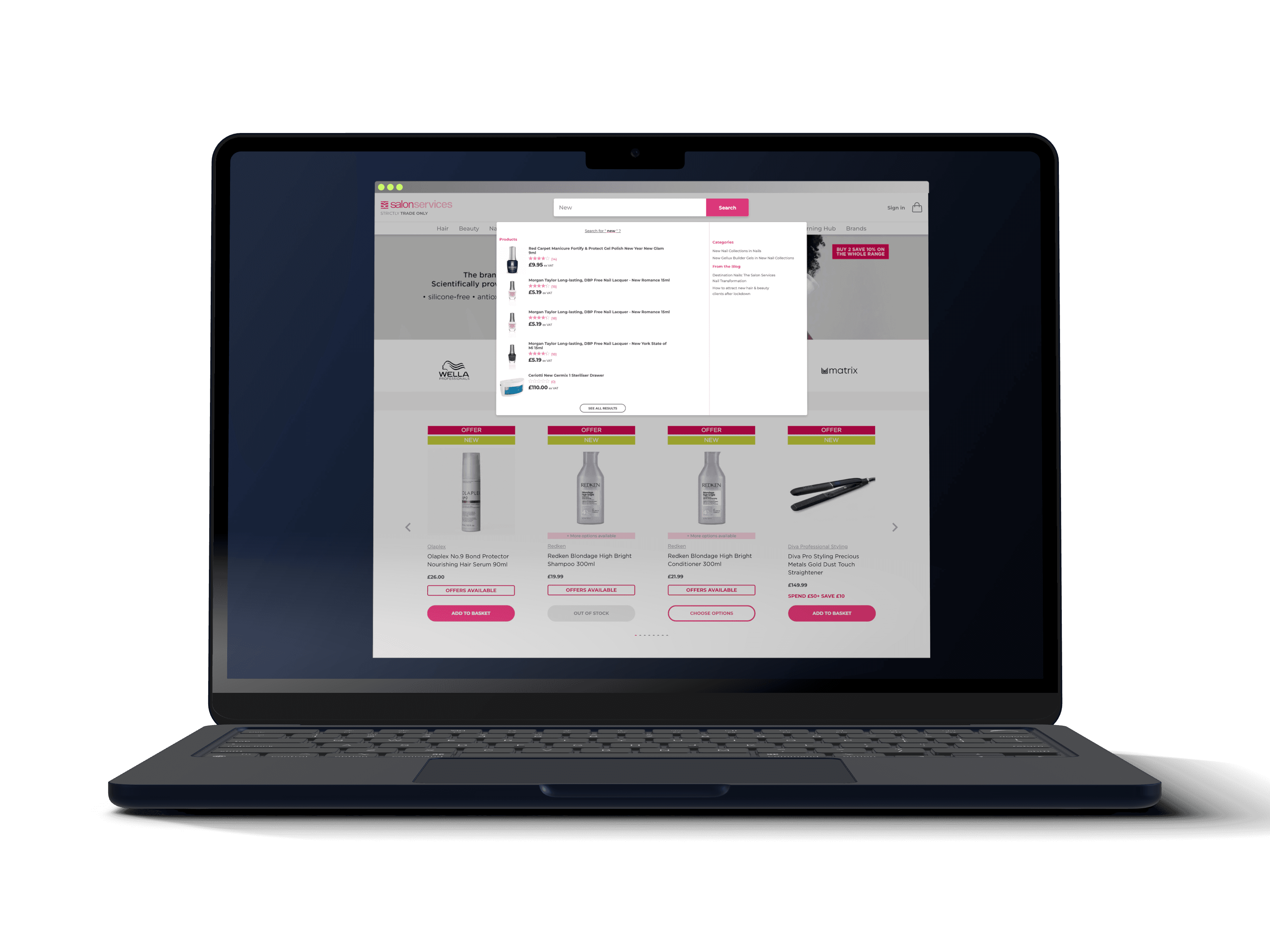
Search was still a tap away, but behind an icon to bring up our live search feature.
We also adjusted features of the header for logged in/out behaviour. Logged out users now saw a "Sign in" message prompting them to log in to shop. Once they were logged in, they saw a new logged in user icon to go with the suite of more uniform icons in the redesign. We also pushed the 'strictly trade only' messaging back under a logo that now had room to breath, when the user logged in, this message would disappear.
Designing responsive interactions
In both the UX and UI part of my role I am a strong proponent of responsive and deliberate feedback to each interaction from the user. This cements a feeling of trust in the software and confirms to the user that the interface has received input, ready for the next step.
As one of my first projects with Sally, I wanted to make sure that the site was ready for a step up in interaction design and so as part of this project I ensured that the Lottie JS library was installed on our sites. Lottie at this point was still a pretty new development, but I knew at the time it would lend itself well to the sorts of micro-interactions and confirmations that I wanted the user to see when on our sites. Early additions such as add to basket response used Lottie on this project, but I have since used it in interaction design on further projects at Sally.